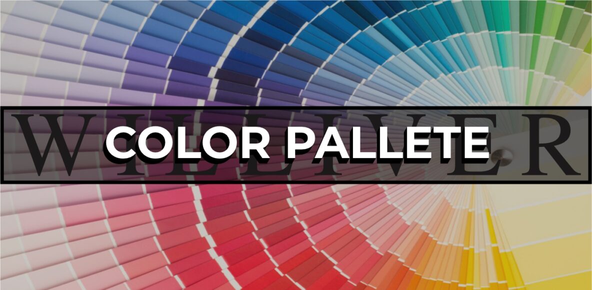
The Power of Color: Choosing the Right Color Palette for Branding and Signage
Color is one of the most impactful elements of branding and signage. It not only defines the aesthetic of a brand but also influences customer perceptions, emotions, and behaviors. For businesses, choosing the right color palette is essential for creating a memorable and cohesive brand experience that resonates with the target audience.
In this blog post, we’ll explore how color impacts branding, the psychology behind popular colors, and best practices for choosing a color palette for signage that enhances visibility, aligns with the brand, and creates a lasting impression.
1. The Role of Color in Branding and Signage
Colors have the power to communicate a brand’s personality and values instantly. For example, bright colors can suggest energy and playfulness, while muted tones convey sophistication and calm. Signage is often the first interaction a customer has with a brand, and color plays a key role in shaping this first impression.
a) Consistency Across Brand Touchpoints
A cohesive color palette across signage, marketing materials, and digital assets strengthens brand recognition and builds trust. When customers see consistent colors in a brand’s logo, storefront, signage, and advertisements, it reinforces the brand’s identity and creates a unified experience.
b) Enhancing Visibility and Legibility
For signage, color is more than just an aesthetic choice; it directly impacts readability and visibility. High-contrast colors make signage easy to read from a distance, while low-contrast colors may be visually appealing up close but challenging to discern from afar. Selecting colors with the right contrast levels is especially important for outdoor signage and directional signage.
c) Evoking Emotional Responses
Color psychology is a powerful tool in branding. Different colors elicit specific emotional responses that influence how customers perceive a brand. For instance, blue often conveys trust and reliability, while red signals excitement and urgency. Understanding these associations can help brands choose colors that align with their message and values.
2. Understanding Color Psychology in Branding
Color psychology plays a significant role in branding by connecting colors with emotions, behaviors, and perceptions. Let’s break down the common associations of primary and secondary colors:
- Red: Associated with energy, passion, and urgency. Red is a bold, attention-grabbing color, often used by brands to evoke excitement or encourage action. Examples include Coca-Cola and Target.
- Blue: Known for evoking trust, calm, and professionalism. Blue is widely used by brands in finance, healthcare, and technology, such as Facebook and American Express.
- Yellow: Represents optimism, warmth, and happiness. Brands like IKEA and McDonald’s use yellow to create an inviting, cheerful atmosphere.
- Green: Often linked with nature, health, and sustainability. Green is ideal for eco-friendly and wellness brands, like Whole Foods and John Deere.
- Orange: Signifies creativity, friendliness, and enthusiasm. Orange is popular for brands that want to appear approachable and energetic, such as Fanta and Nickelodeon.
- Purple: Suggests luxury, creativity, and wisdom. Purple is often used by premium brands and those targeting a sophisticated audience, such as Cadbury and Hallmark.
- Black and White: Black represents sophistication, elegance, and power, while white symbolizes purity, simplicity, and cleanliness. High-end brands like Chanel and Apple use black-and-white palettes to convey luxury and minimalism.
By aligning the color palette with the brand’s core values and intended customer emotions, businesses can craft a visual identity that resonates with their audience.
3. Best Practices for Choosing a Color Palette for Signage
Designing effective signage requires a strategic approach to color that considers branding, visibility, and the setting. Here are some best practices for selecting a color palette for signage:
a) Prioritize Contrast for Readability
High contrast between the background and text is crucial for signage readability. For example, dark text on a light background or vice versa creates a clear visual contrast that makes text easy to read. Avoid pairing colors with similar brightness, as this can make signs difficult to decipher from a distance.
b) Choose Colors Suitable for the Environment
Consider the surrounding environment when selecting colors for outdoor signage. A green sign may blend into a natural landscape, making it harder to see, while a red or yellow sign stands out. Similarly, in urban areas with bright lights and competing signage, bolder colors can help a sign grab attention.
c) Account for Brand Identity and Industry Standards
Colors used in signage should align with the brand’s identity. For example, luxury apartments might use muted tones or metallics to convey sophistication, while a family-friendly brand might use bright, inviting colors. Additionally, consider industry standards; for instance, hospitals and emergency services often use red for its association with urgency and attention.
d) Consider ADA Compliance for Accessibility
ADA (Americans with Disabilities Act) guidelines emphasize the importance of color contrast in accessible signage, particularly for directional and informational signs. To meet ADA standards, ensure there is at least a 70% contrast between the background and text. This ensures the signage is readable for individuals with visual impairments and other disabilities.
e) Limit the Palette for Cohesion
While a diverse color scheme can add vibrancy, it’s best to limit the color palette to no more than three or four colors for signage. Too many colors can create visual noise and make the signage look cluttered. A limited palette keeps the design cohesive and enhances brand recognition.
4. How to Build a Color Palette for Your Brand’s Signage
Building a color palette that represents your brand’s values, enhances visibility, and maintains consistency across all touchpoints is key. Here’s a step-by-step guide to developing a color palette for branding and signage:
Step 1: Define Your Brand Personality
Before choosing colors, define the brand’s personality and core values. Consider adjectives that describe the brand, such as “innovative,” “trustworthy,” “friendly,” or “sophisticated.” The colors you choose should reflect these traits to create an authentic connection with your audience.
Step 2: Choose a Primary Brand Color
Select a primary color that captures the essence of your brand. This color will be used most prominently in your signage, logo, and other brand assets. Choose a color that aligns with the brand’s identity and resonates with the target audience.
Step 3: Add Supporting Colors
Select one or two supporting colors that complement the primary color. These colors add variety and can be used for accents in signage design. Supporting colors should harmonize with the primary color and help enhance the overall look without overwhelming it.
Step 4: Include a High-Contrast Color
Incorporate a high-contrast color for readability, particularly in text. This color will likely be used as the background or text color on signage to ensure clarity and accessibility.
Step 5: Test the Palette in Different Contexts
View the color palette in various settings and lighting conditions. Colors may appear different in natural light, artificial light, and on different surfaces. Ensure the colors remain readable and consistent across environments, especially for exterior signage that is exposed to sunlight and weather.
5. Examples of Effective Color Palettes in Signage
Let’s look at some real-world examples of color palettes that work well in signage:
- Corporate Office Buildings: Neutral tones like navy, gray, and white, with high-contrast accents like black or dark green. This palette conveys professionalism, stability, and sophistication, ideal for corporate branding.
- Fitness Centers and Gyms: Bold, energetic colors like red, black, and neon accents (like yellow or orange). These colors evoke energy and movement, aligning with the dynamic atmosphere of fitness environments.
- Eco-Friendly Retail Spaces: Greens, tans, and whites with natural wood textures. These earthy tones represent sustainability and calm, appealing to eco-conscious customers.
- Luxury Retail Stores: Black, gold, and white, often with metallic finishes. This high-contrast, minimalist palette communicates luxury, exclusivity, and sophistication, commonly seen in high-end boutiques.
Color as a Strategic Branding Tool
Color is one of the most effective tools for establishing a brand identity and creating impactful signage. A well-chosen color palette helps attract customers, communicate the brand’s personality, and improve readability, especially from a distance. By understanding the psychology behind colors, focusing on high contrast for readability, and choosing colors that align with the brand’s identity, businesses can create signage that not only stands out but also strengthens brand recognition.
Ultimately, color selection is a powerful strategic decision. With thoughtful planning and an understanding of color psychology, brands can use color to create memorable and effective signage that resonates with their audience and reinforces their brand’s message across all touchpoints.