Sign Education
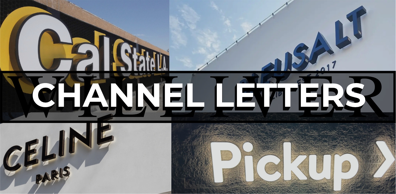
Channel Letters
The most popular type of signage is channel letters. These signs are three-dimensional, individually crafted letters or symbols typically used for exterior signage on buildings. They can be illuminated from within or behind, using LEDs, making them visible at night and enhancing brand visibility. These signs can be customized in terms of font, size, color, and lighting style, allowing businesses to create eye-catching, professional displays that attract attention. These letters can be individually mounted on a building or attached to a raceway, making installations easier and cleaner.
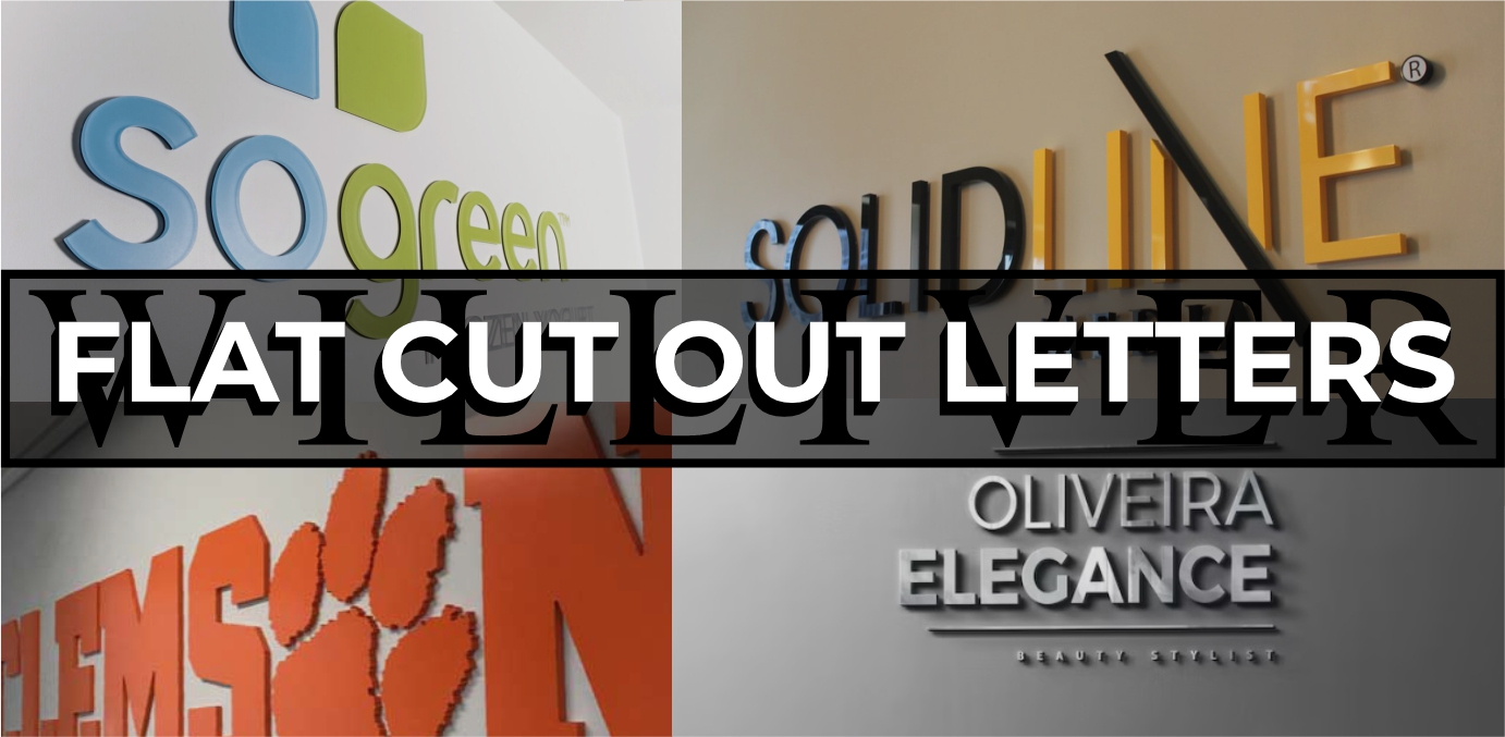
FCO LETTERS
FCO (Flat Cut Out) letters can come in many different materials and styles. These letters can be illuminated or non-illuminated and cut in a variety of different depths. They can also be mounted using studs, spacers or flush to a wall. These letters come in materials such as aluminum, steel, acrylic, composite or PVC. They are precisely cut to create a clean appearance. FCO letters offer a sleek, professional look and are ideal for businesses seeking durable, stylish signage that doesn’t always require electrical lighting.
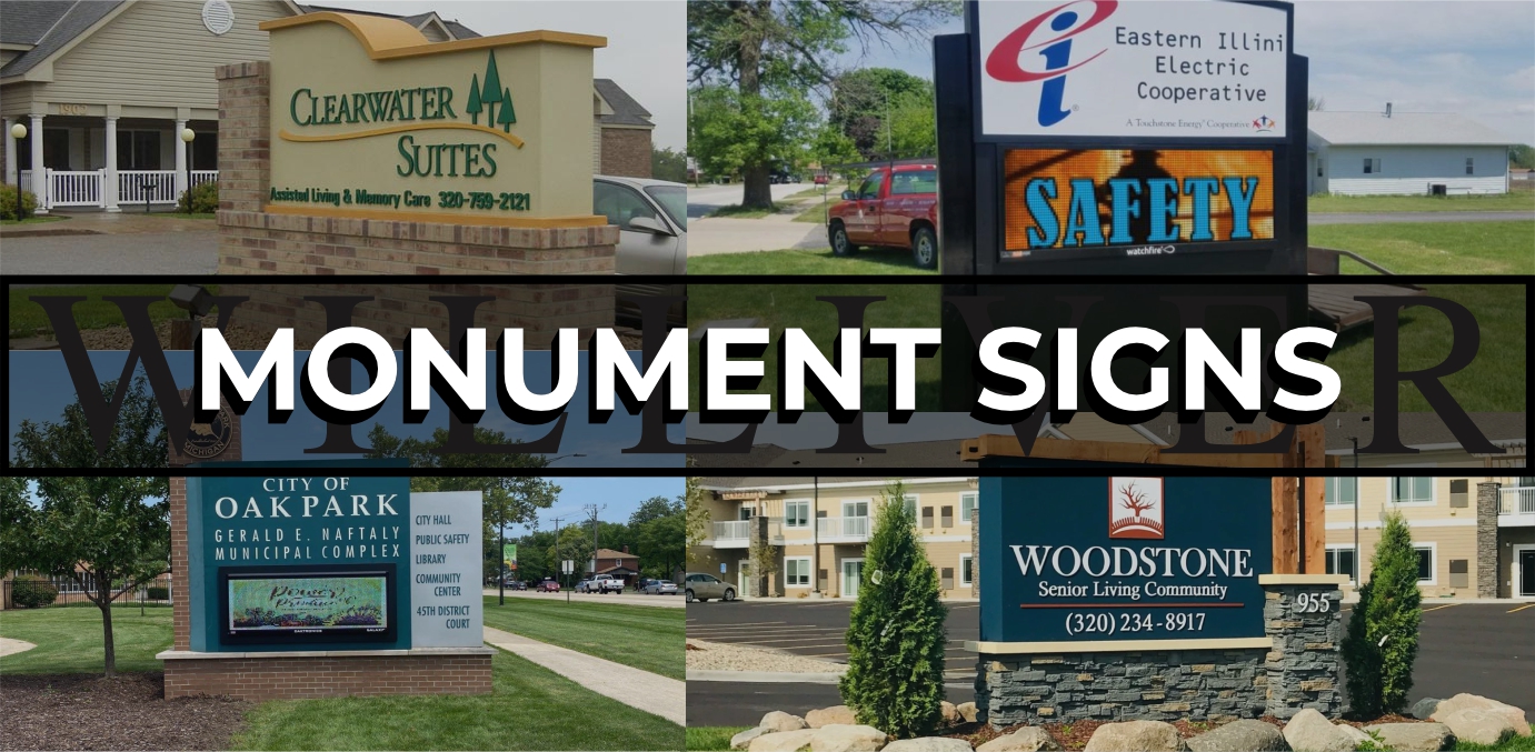
MONUMENT SIGNS
Monument signs are freestanding structures typically placed at the entrance of a property, featuring a business name or logo for high visibility. They can be made from materials like brick, stone, or metal, but value engineering with stucco foam offers a cost-effective alternative. Stucco foam provides the look of solid, traditional materials while being lighter, easier to install, and less expensive, allowing businesses to achieve a high-end appearance without the high-end cost. Monument signs can also enclose an Electronic Message Display sign, maximizing the outreach of advertising to passing customers.
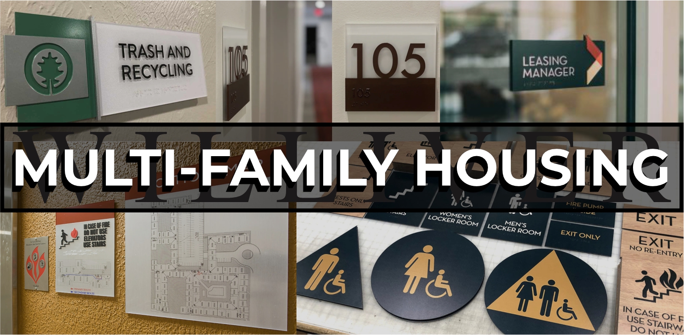
MULTI-FAMILY HOUSING
Multi-family housing signage must comply with ADA (Americans with Disabilities Act) requirements, ensuring accessibility for all residents and visitors. This includes components like braille, tactile lettering, and high-contrast colors to make signs easy to read for individuals with visual impairments. The signage can vary widely in design and materials, ranging from sleek metal and acrylic to rustic wood or stone finishes, allowing property managers to match the aesthetic of the building's architectural features. Common types include wayfinding signs, apartment numbers, building directories, and safety information, all crafted to be both functional and visually appealing.
INTERIOR SIGNS
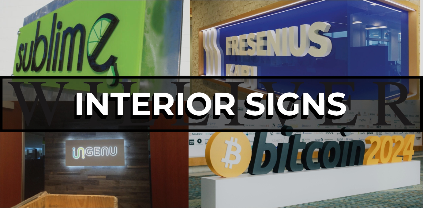
Interior signs with illumination add a dynamic and modern touch, using LED backlighting or edge lighting to make the signage stand out in dim environments. These signs can also feature dimensional elements, like raised letters or logos, creating depth and a three-dimensional effect that draws attention. Mounted on panels made from materials like acrylic, metal, or wood, they offer a polished, professional look, suitable for lobbies, offices, and retail spaces. Decorative standoffs are often used to give the signs a sleek, floating appearance, adding an extra layer of style and sophistication to the design.
WINDOW GRAPHICS
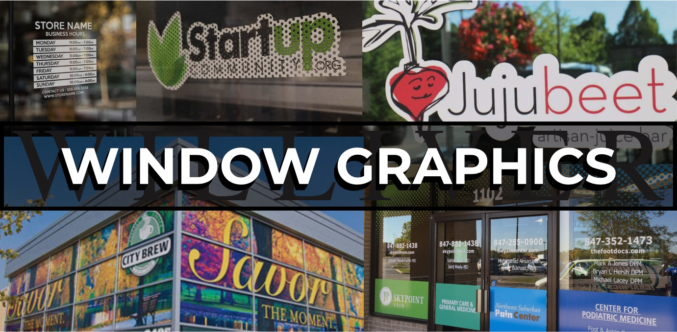
Window graphics are versatile visual displays that can be applied directly to glass surfaces, such as storefront windows, office partitions, or vehicle windows. They come in two main types: perforated and opaque. Perforated window graphics have tiny holes that allow visibility from the inside while displaying a full-color image on the outside, making them ideal for promoting brands without blocking the view. Opaque window graphics, on the other hand, completely cover the glass, offering privacy and bold, vibrant visuals that can enhance branding or serve as decorative elements.
POST & PANEL SIGNS
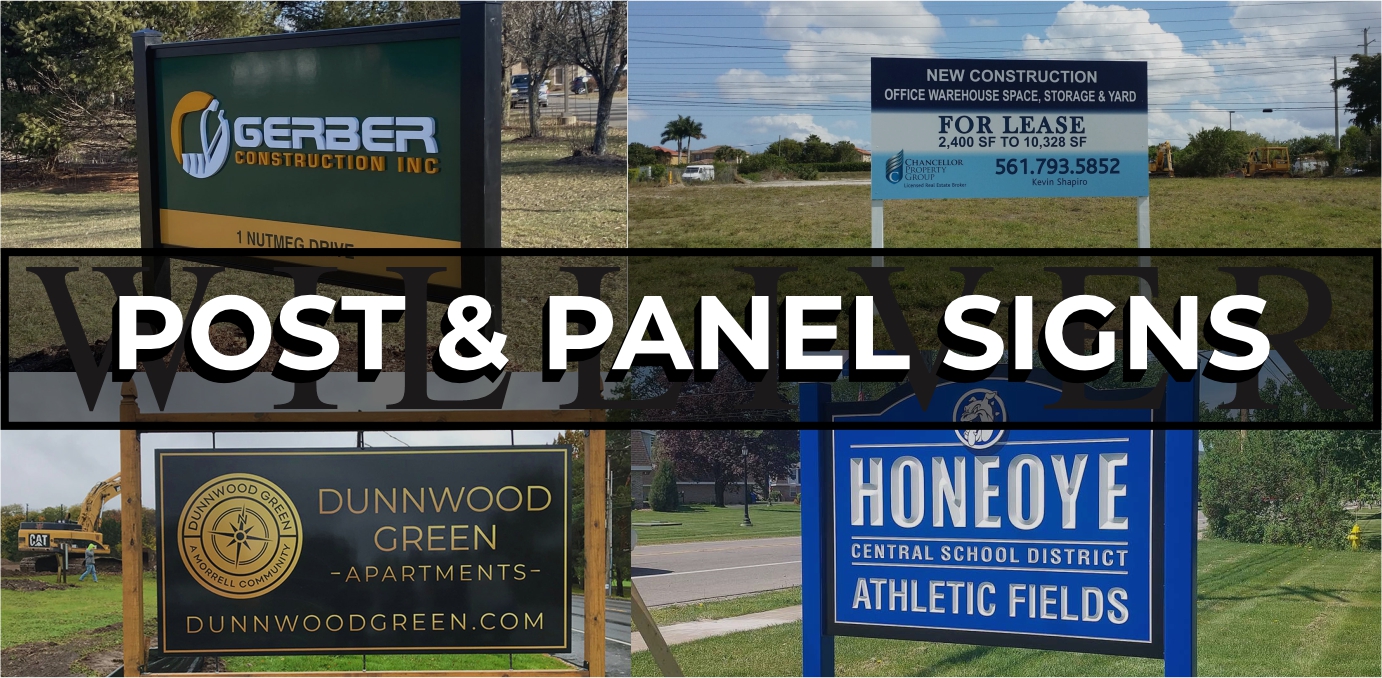
Post and panel signs are a popular, versatile signage solution consisting of one or more panels mounted between two posts. The posts can be made from materials like wood or aluminum, offering options that suit both rustic and modern aesthetics. Panels can be crafted from a variety of materials, such as aluminum, PVC, acrylic, or even wood, allowing for customized designs with full-color graphics, text, or logos. Ideal for directional, informational, or identification purposes, post and panel signs are durable and easy to install, making them perfect for businesses, schools, parks, and real estate properties. They can used as a temporary or permanent structure, depending on the need.
CARVED SIGNS
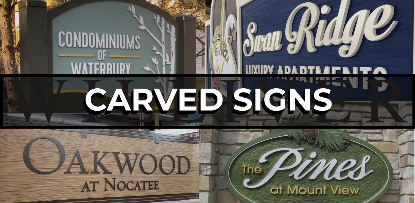
Carved signs made from HDU (High-Density Urethane) or foam offer a classic, handcrafted look that mimics the appearance of wood without the drawbacks of rotting, warping, or cracking. HDU is a lightweight, durable material that can be intricately carved to create raised or recessed lettering, logos, and decorative details. Foam signs can also be coated and painted to achieve various finishes, from natural wood grain to sleek, modern colors. These signs are weather-resistant, making them an excellent choice for outdoor use, and are popular for businesses, resorts, and establishments seeking a refined, traditional aesthetic.
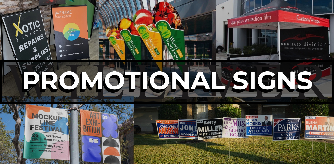
PROMOTIONAL SIGNS
Promotional signs come in various forms, including canopies, banners, yard signs, feathered flags, tablecloths, and A-frames, each designed to attract attention and boost visibility for businesses or events. Canopies provide shade while displaying logos or messages, making them ideal for outdoor markets, festivals, and trade shows. Banners are versatile and can be hung on walls, fences, or across streets to promote sales, grand openings, or special events. Yard signs, feathered flags, and A-frames are portable and easy to set up, offering eye-catching displays for storefronts, sidewalks, or lawns to capture the attention of passing customers.
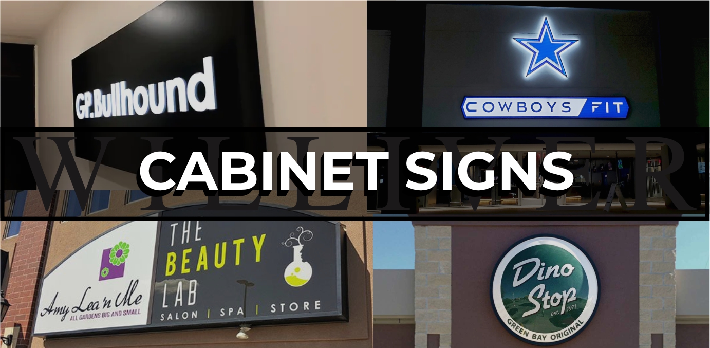
CABINET SIGNS
Cabinet signs are versatile, box-shaped, or custom-shaped signs that can be mounted on building exteriors or freestanding structures, providing a prominent display for business names, logos, or messages. They can feature push-through letters, where the letters are cut out from the face of the sign and illuminated from behind, creating a striking, glowing effect. Cabinet signs can be either illuminated or non-illuminated, with options for face-lit designs that shine light through the front of the sign or back-lit designs that create a subtle halo effect around the letters. Built to be durable and weather-resistant, these signs are ideal for businesses seeking a bold, visible presence both day and night. They can also be installed inside or outside of a business.
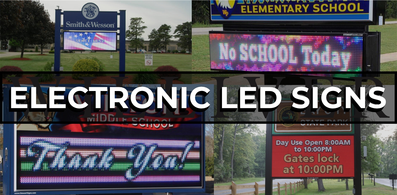
ELECTRONIC LED SIGNS
EMC (Electronic Message Center) LED signs have evolved significantly over the years, moving from older DIP (Dual In-line Package) bulb modules to modern SMD (Surface-Mount Device) technology. Early versions of EMC board signs used DIP bulbs, which consisted of a single bulb for each RGB color in one group. The bulbs were larger and less efficient, often resulting in lower resolution and limited color ranges. Today's SMD modules combine RGB (Red, Green, Blue) pixels into a single compact unit, allowing for higher resolution, brighter displays, and a wider spectrum of vivid colors. These advancements make modern LED EMC signs more energy-efficient, visually striking, and capable of displaying dynamic, full-motion graphics that attract attention and engage viewers better than ever before.
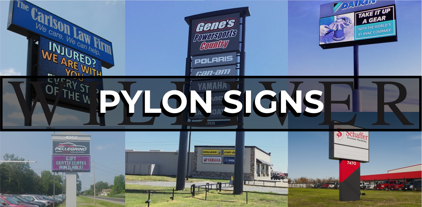
PYLON SIGNS
Pylon signs are tall, freestanding structures that provide high visibility for businesses, often located near busy roads to attract passing traffic. They are commonly used for multi-tenant properties, such as shopping centers, office complexes, and plazas, where they can display the names and logos of multiple businesses on a single sign. Pylon signs can be customized with illuminated or non-illuminated panels, making them effective both during the day and at night. With their elevated height and durable construction, these signs offer a prominent, professional way to showcase multiple brands in one location, guiding customers to the property with ease. The biggest benefit of an elevated pylon sign is using the single pole for multiple different cabinets, sometimes combining a standard illuminated cabinet sign with an EMC board below it on the same pole.
BLADE SIGNS
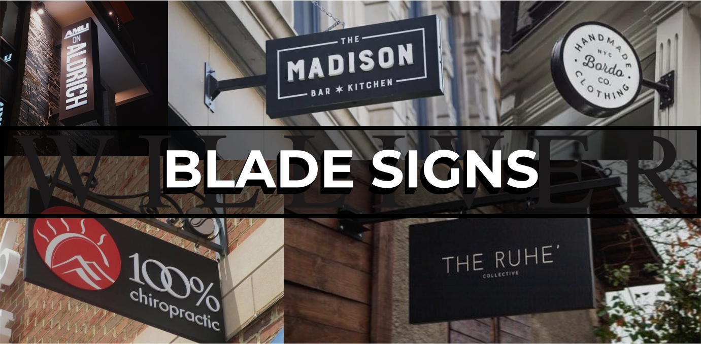
Blade signs are mounted perpendicular to the building facade, projecting outwards to catch the attention of pedestrians walking along the street. They can be hung using decorative brackets or directly mounted to the wall, making them versatile for various architectural styles. Blade signs can be illuminated or non-illuminated; illuminated versions often use push-through acrylic lettering, where the letters are cut out and backlit, creating a bright, eye-catching effect at night. Non-illuminated blade signs rely on bold designs and colors, standing out in daylight and offering a classic, timeless look that is perfect for retail stores, cafes, and restaurants.
DOT SIGNS
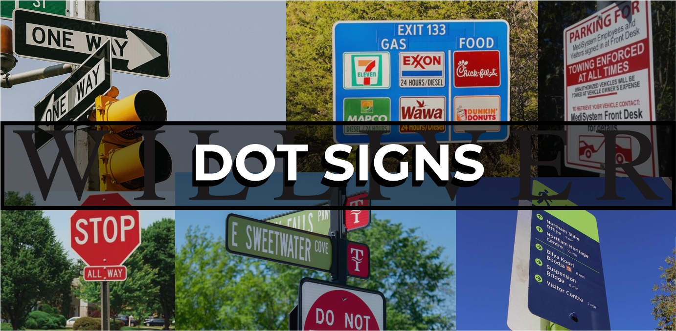
DOT (Department of Transportation) signs, including custom street signs, highway exit signs, stop signs, and one-way street signs, are essential for guiding traffic and ensuring safety on the road. These signs are designed to be highly visible, with reflective surfaces that improve readability both during the day and at night. Custom street signs and highway exit signs help direct drivers to specific destinations, while regulatory signs like stop signs and one-way indicators provide clear instructions to control traffic flow. Directories in parking lots or multi-lane areas also fall under DOT signage, helping drivers navigate complex spaces efficiently and safely. All of these signs or the mounting accessories can be customized to fit into any HOA regulations or branding packages.
WAYFINDING SIGNS
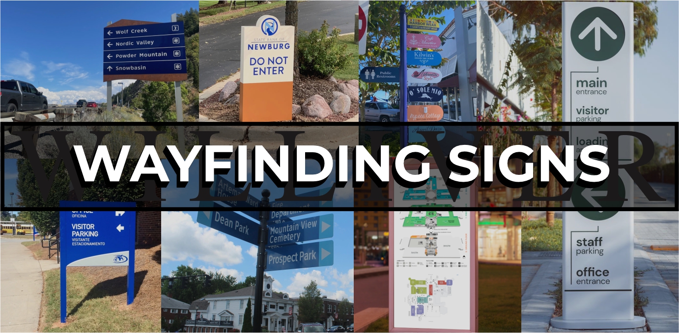
Exterior wayfinding signs on campuses or in towns help visitors and residents navigate large, complex areas by providing clear, visible directions and information. These signs include directional markers pointing to key locations like buildings, parking lots, restrooms, and bus stops, as well as maps to give an overview of the area. Identification signs label specific buildings or landmarks, helping people easily find their destinations, while regulatory signs manage traffic flow and safety, such as indicating pedestrian crossings or restricted areas. Designed to withstand outdoor elements, these signs are often made with durable materials and feature bold colors and fonts to ensure they are easily readable from a distance.
DESIGN Education
Tell Me More
Even though different types of signs are important—whether they are directional, promotional, or regulatory— the most crucial part of any sign project is the design and branding phase. This initial stage sets the foundation for how effectively the sign will communicate its message and resonate with its intended audience.
A well-designed sign captures attention, reinforces brand identity, and ensures consistency across various locations, which is vital for building brand recognition and trust. By focusing on design and branding first, businesses can ensure that the colors, fonts, and overall visual elements align with their image and goals, creating a cohesive experience that enhances customer engagement. Ultimately, a sign that is thoughtfully designed is more than just a piece of communication; it's a powerful tool that represents a brand’s personality and message, making the design and branding phases essential first steps in any successful sign project.
At Williver Sign Co, we are deeply committed to the branding and design phase of every sign program to ensure that the final product meets the highest standards of excellence. We believe that a well-thought-out design is the foundation of an effective sign, and we work closely with our clients to capture their brand’s essence in every detail. From selecting the perfect color palette and typography to creating a striking visual layout, our team ensures that each sign not only stands out but also aligns seamlessly with the client’s brand identity. Our dedication to precision and quality during the design phase means that the final product is not just a sign, but a powerful representation of the brand’s message.
how we start
- Logo Design: A distinctive logo is the centerpiece of any brand, serving as the most recognizable visual element. It should be simple, memorable, and convey the essence of the brand.
- Color Palette: Colors evoke emotions and associations, making the right color palette essential for creating a brand's identity. Consistent use of colors helps reinforce brand recognition across various media.
- Typography: Fonts play a crucial role in conveying a brand’s personality, whether it's modern, traditional, playful, or professional. Consistent typography helps maintain a cohesive look and feel.
- Tagline and Messaging: A strong tagline and clear messaging convey the brand's core values and promise. Consistent, well-crafted language helps build a connection with the audience.
- Consistency: One of the most important aspects, consistency across all branding elements ensures that the brand is easily recognizable, whether it’s on signage, packaging, social media, or other platforms.
- Layout and Design Principles: Effective use of space, alignment, and hierarchy in design ensures that information is presented clearly and attractively, enhancing readability and impact.
- Brand Voice and Tone: The style and tone of communication should match the visual identity, creating a cohesive brand experience. It sets the mood for how the brand interacts with its audience, whether formal, casual, friendly, or authoritative.
- Imagery and Graphics: The style of images, icons, and illustrations used can help build the brand’s visual language. Choosing the right graphics ensures that the brand’s message is communicated clearly and consistently.
LOGO DESIGN
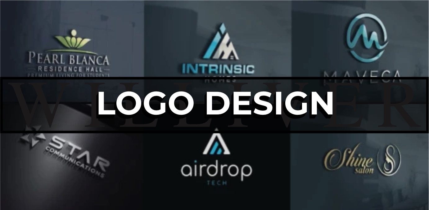
Logo design is the process of creating a visual symbol that represents a brand or organization. A well-designed logo should be simple, memorable, and versatile, making it easily recognizable across various platforms. It often combines typography, shapes, and colors to convey the brand's identity and values. A successful logo not only grabs attention but also establishes an emotional connection with the audience.
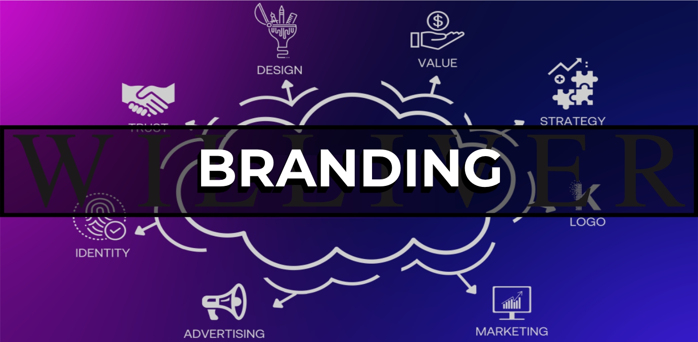
BRANDING
Branding is the strategic process of shaping a company's identity and how it is perceived by the public. It involves creating a consistent message, image, and experience through elements like logo design, colors, tone of voice, and marketing efforts. A strong brand helps build trust and loyalty, making a company stand out in a crowded market. Effective branding aligns with a company's values and resonates with its target audience, fostering long-term customer relationships.
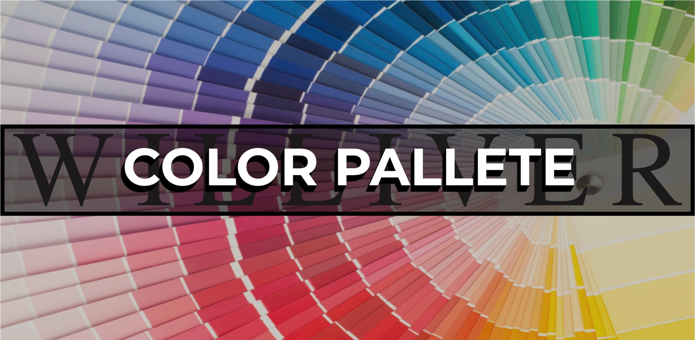
COLOR PALLETE
Color palettes play a crucial role in conveying a brand's personality and evoking specific emotions. The choice of colors can influence how a brand is perceived, with different hues representing qualities like trust, energy, or sophistication. A well-crafted color palette ensures consistency across all brand materials, from the logo to advertisements and packaging. By selecting colors that resonate with the target audience, designers can create a strong visual identity that enhances brand recognition and recall.
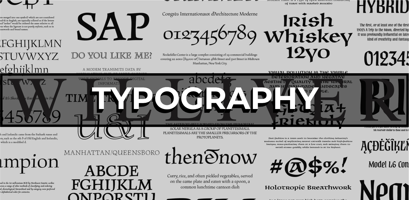
TYPOGRAPHY
Typography, also known as font, is key to communicating a brand’s tone and character. The choice of fonts can evoke various feelings, from professionalism and elegance to playfulness and creativity. A well-chosen typeface ensures readability and consistency across all branding elements, reinforcing the brand’s identity. By carefully balancing style, spacing, and weight, typography helps make the brand more memorable and visually appealing.
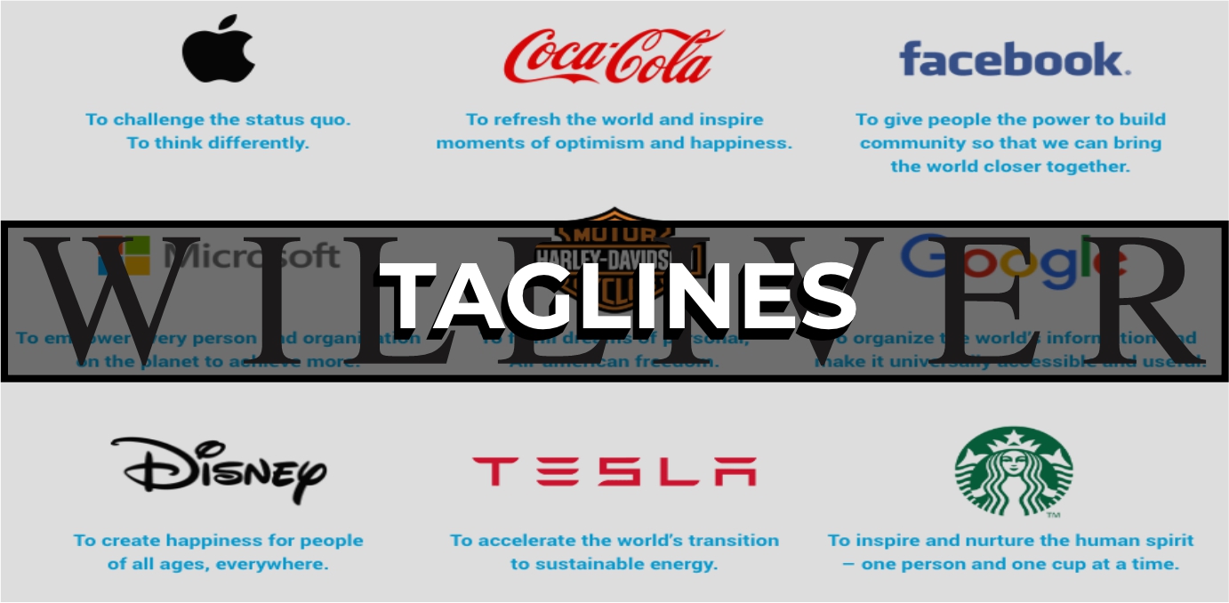
TAGLINES
Taglines are short, memorable phrases that encapsulate the essence of a company’s brand and values. They serve as a powerful tool for reinforcing a brand’s message, helping to differentiate it in the marketplace. A well-crafted tagline resonates with the target audience, creating an emotional connection and leaving a lasting impression. By complementing the visual identity, taglines add depth to the brand’s narrative and enhance overall recognition.
VOICE & TONE
Voice and tone in branding define how a company communicates with its audience, shaping the personality and emotional impact of the brand. The brand voice remains consistent, reflecting its core values, whether it’s formal, friendly, or quirky, while tone can shift depending on the context or platform. A well-defined voice and adaptable tone help build a relatable connection with the audience, making messages more authentic and engaging. By aligning voice and tone with the brand’s identity, companies can create a cohesive and memorable customer experience across all touchpoints.

IMAGERY
Imagery and mascots are powerful tools in branding that visually represent a company's personality and values. Well-chosen imagery can evoke emotions, tell stories, and enhance brand messaging, creating a deeper connection with the audience. Mascots, often personified characters, serve as a relatable face for the brand, making it more approachable and memorable. By consistently using imagery and mascots across branding materials, companies can strengthen recognition and foster brand loyalty.
LAYOUT PRINCIPLES
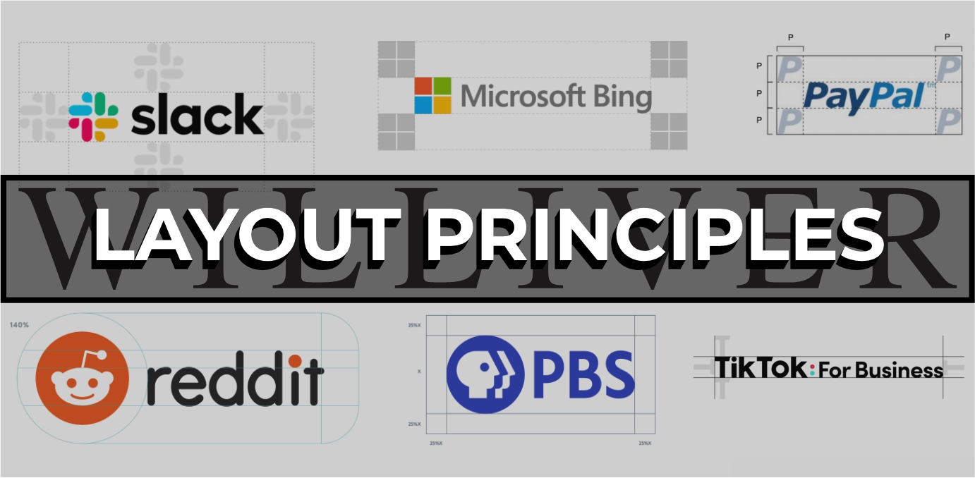
Consistent layout principles are essential in branding to create a cohesive and recognizable visual identity across all touchpoints. By maintaining uniformity in elements like spacing, alignment, and grid structure, brands ensure that their content is easily navigable and visually appealing. A well-structured layout enhances communication by guiding the viewer’s attention to key messages, reinforcing brand identity in the process. Consistency in layouts also helps build trust and familiarity, making the brand more professional and reliable in the eyes of its audience.