Wayfinding Signage: Creating Navigable Spaces and Enhancing User Experience
Wayfinding signage is a vital part of any built environment, guiding people through spaces and helping them reach their destinations with ease. Effective wayfinding systems are more than just directional signs; they are strategic tools that enhance user experience, reinforce brand identity, and improve the functionality of a space. From hospitals and airports to office buildings and shopping malls, well-designed wayfinding signage reduces confusion, saves time, and fosters a sense of orientation.
In this blog post, we’ll explore the key components of wayfinding signage, the principles behind effective wayfinding design, and best practices for creating clear, accessible, and visually appealing signage that enhances navigation in any environment.
1. What Is Wayfinding Signage?
Wayfinding signage is a system of signs, symbols, and visual cues that help people navigate through a physical space. The goal of wayfinding signage is to guide visitors efficiently and intuitively by providing clear, actionable information about directions, locations, and key points within a space.
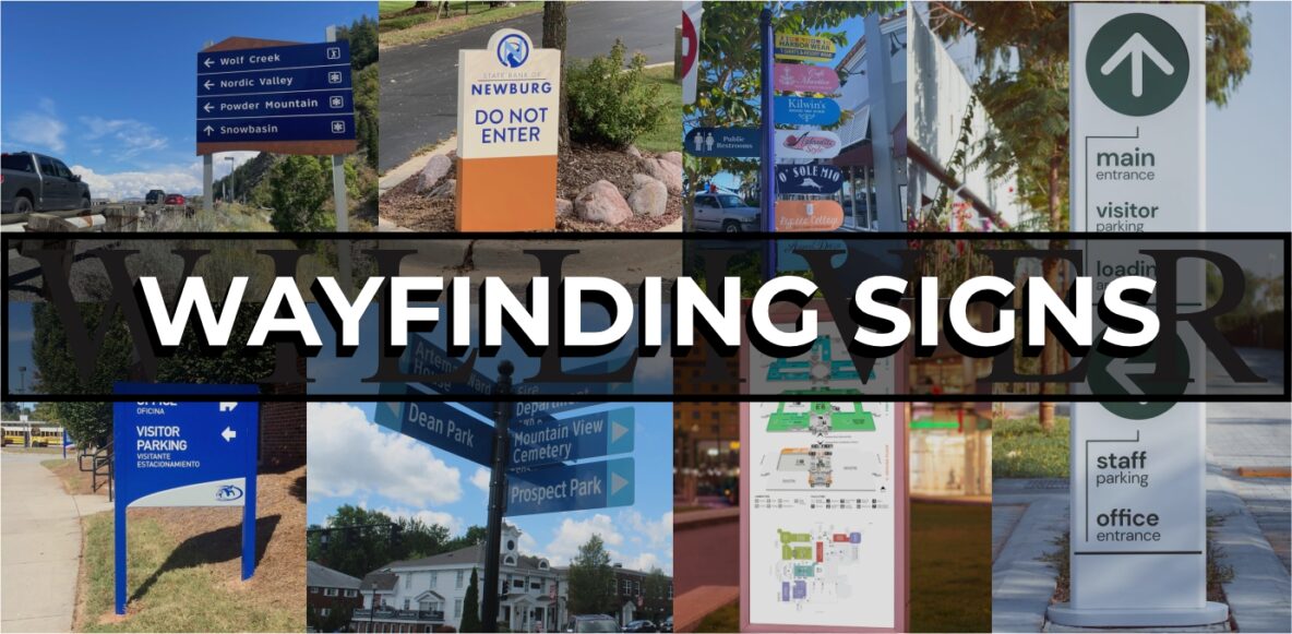
Wayfinding signage includes various types of signs, such as:
- Directional Signs: Pointing visitors toward destinations, exits, and major areas within a building or facility.
- Identification Signs: Marking rooms, floors, entrances, and exits to clarify where the visitor is within the space.
- Regulatory Signs: Informing visitors of rules, restrictions, or safety instructions (e.g., “Authorized Personnel Only” or “No Smoking”).
- Informational Signs: Providing additional information, such as maps, directories, and emergency evacuation instructions.
2. Principles of Effective Wayfinding Design
Designing wayfinding signage is about much more than just putting up arrows. A successful wayfinding system combines design principles, psychology, and an understanding of the user journey. Here are key principles that contribute to effective wayfinding:
a) Simplicity and Clarity
The primary goal of wayfinding signage is to provide clear, straightforward information. Avoid overly complex language, decorative fonts, or excessive details that may confuse users. Simple, clean, and intuitive design allows visitors to understand directions at a glance, reducing the time they spend reading or deciphering signage.
b) Consistency in Design
Consistency in color, font, and style throughout all signage establishes a visual language that users quickly become familiar with. This consistency builds trust and reassures visitors that they’re on the right path. For example, using a distinct color for exit signs or a particular font for directional signs helps users immediately identify their function.
c) Hierarchy of Information
An effective wayfinding system organizes information in a hierarchical way, prioritizing what visitors need to know at each step. Major destinations (e.g., “Lobby,” “Emergency Room”) should be highly visible, while secondary information (e.g., room numbers, amenities) is smaller or lower in the visual hierarchy. This makes navigation intuitive, allowing users to understand what’s most important first.
d) Accessibility and Inclusivity
Wayfinding signage should be accessible to all users, including those with disabilities. This includes adhering to ADA (Americans with Disabilities Act) guidelines, such as using high contrast, non-glare materials, Braille, and tactile lettering. Clear, accessible design improves navigation for all individuals, regardless of their physical or cognitive abilities.
e) Logical Placement
Signs should be placed where users naturally look when searching for directions. At decision points—such as intersections, elevators, and stairways—clear signage can guide visitors. Avoid placing signs in cluttered areas or locations with poor lighting, as this can hinder visibility and readability.
3. Types of Wayfinding Signs and Their Purposes
A comprehensive wayfinding system includes various types of signs, each serving a specific purpose to create a cohesive navigation experience.
a) Directional Signs
Directional signs point people toward key destinations or areas, providing visual cues on where to go. These signs are typically found at intersections, near elevators, or along hallways. Arrows, bold fonts, and color-coding are often used to make directional signs stand out and make paths clear.
b) Identification Signs
Identification signs label specific rooms, floors, and sections within a building, helping users confirm their location. Examples include floor markers in an elevator, door labels for conference rooms, and entry signs for major departments. Identification signs also reinforce brand identity by often incorporating logos or brand colors.
c) Informational Signs
Informational signs provide useful details that help users understand their environment. Examples include maps, directories, and digital displays that show the layout of a space. These signs are often located at key entry points, such as the lobby, main entrance, or reception area.
d) Regulatory and Safety Signs
These signs inform visitors of important rules, regulations, and safety instructions. They are especially common in facilities with specific policies, like “No Smoking” areas or “Restricted Access” zones. Emergency exits, evacuation routes, and fire safety instructions also fall under this category.
e) Digital Wayfinding Signs
Digital signage is increasingly popular for wayfinding due to its adaptability and real-time update capabilities. Digital screens or interactive kiosks provide flexible navigation options, allow for updated information (e.g., schedules or events), and can even offer multilingual options. In complex environments like hospitals or airports, digital signage provides a dynamic solution for effective navigation.
4. Best Practices for Wayfinding Signage Design
Designing wayfinding signage involves careful planning to create a seamless user journey. Here are some best practices to keep in mind:
a) Use High-Contrast Colors and Legible Fonts
High-contrast color combinations (such as black on white, or yellow on dark blue) improve readability, especially from a distance. Fonts should be simple and bold, with adequate spacing between letters to ensure clarity. Avoid overly decorative fonts or low-contrast color combinations, which can hinder readability.
b) Incorporate Symbols and Pictograms
Symbols and pictograms are universally recognized and can be understood regardless of language. Icons like arrows, restroom symbols, and accessibility symbols quickly convey information without the need for lengthy text. Using standardized icons also creates a more inclusive wayfinding system, as they are helpful for non-native speakers and those with limited reading abilities.
c) Create a Color-Coded System
Color coding different sections or types of areas can help users understand and remember their location within a space. For example, using blue for public areas, green for exits, and red for restricted zones creates a visual language that enhances navigation. Color-coding works well in multi-level or large buildings, where each floor or zone has a distinct color for easy identification.
d) Ensure Proper Lighting for Visibility
Lighting is critical for wayfinding signs, particularly in dark or dimly lit areas. Illuminated signs, reflective materials, or backlit letters enhance visibility and make it easier to find directions, even at night. Good lighting not only improves readability but also enhances the aesthetic appeal of the signage.
e) Consider Digital Options for Flexibility
Digital wayfinding signs are a great solution for environments with frequent updates, like hospitals or large retail spaces. They allow for real-time updates, which can guide visitors to specific locations, show current events, or offer temporary directions during renovations. Interactive kiosks or mobile wayfinding apps also allow users to search for specific locations and receive customized directions.
5. Wayfinding and Branding: Creating a Seamless Experience
Wayfinding signage provides an excellent opportunity to reinforce brand identity and create a consistent brand experience. Integrating brand elements, such as logos, colors, and typography, into wayfinding signs helps reinforce the brand’s presence and create a unified feel.
For instance, a university campus can use the school’s colors and emblem in all wayfinding signs, making navigation feel like part of the campus experience. In corporate offices, subtle branding on wayfinding signs can make visitors feel immersed in the brand’s environment.
6. Evaluating and Improving Wayfinding Systems
A well-designed wayfinding system should be regularly evaluated and updated based on user feedback and changes within the space. Conducting user testing, collecting visitor feedback, and monitoring foot traffic patterns can reveal potential improvements in signage placement, wording, or design.
a) Gathering User Feedback
Feedback from visitors can highlight areas of confusion or signage that is hard to understand. Surveys, interviews, or on-site observations can provide insights into the effectiveness of the wayfinding system.
b) Adjusting for Environmental Changes
As spaces evolve—such as new renovations, layout changes, or expanded areas—signage should be updated accordingly. Ensure that any changes to floor plans or key areas are reflected in the wayfinding system to maintain accuracy.
c) Monitoring Traffic Patterns
Observing foot traffic patterns can identify high-traffic areas and common navigation challenges. Placing more visible signage in these areas, or adding additional directional signs, can enhance the flow and usability of the space.
Wayfinding Signage as a Critical User Experience Tool
Wayfinding signage is an essential component of user experience in any built environment. A well-designed wayfinding system does more than guide people; it reduces stress, enhances accessibility, and creates a seamless experience that aligns with the brand. By applying principles of simplicity, consistency, accessibility, and thoughtful placement, you can design a wayfinding system that helps people navigate spaces intuitively and confidently.
Whether you’re designing for a corporate campus, healthcare facility, retail center, or any other space, investing in effective wayfinding signage is a powerful way to enhance visitor satisfaction and make a positive, lasting impression.